
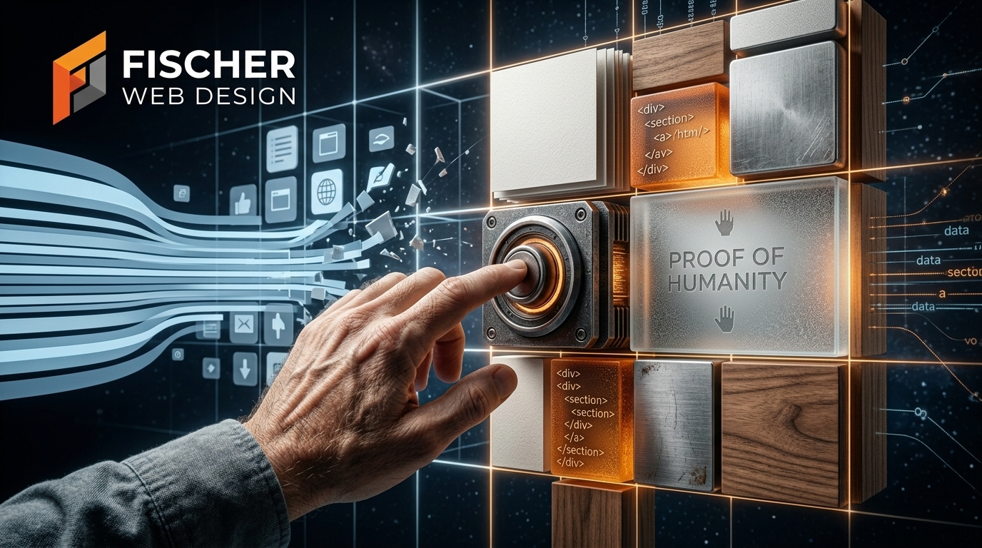
In the modern digital landscape, a subtle yet profound fatigue has set in.
Over the last decade, AI image generators, design template farms, and rigid component libraries have flooded the internet with hyper-sanitized, glass-smooth, ultra-flat web pages. Every corporate landing page looks like a clone of a clone: sterile white backgrounds, flat vector icons, and stock photography so polished it feels artificial.
When everything looks frictionless and manufactured, nothing feels real.
In response to this sea of digital sameness, web architecture is undergoing a major shift—what I call The Tactile Counter-Revolution. Designers and architects are bringing back subtle paper textures, procedural SVG grain, hand-drawn wireframe accents, and soft physical elevation.
This isn’t a return to the clunky, unoptimized leather-and-wood designs of 2007. It is a deliberate, highly engineered movement to restore depth, character, and digital trust to the web.
1. Proof of Humanity: Texture as Authenticity in the AI Era
When a prospective client lands on your website today, their internal radar for generic marketing noise is higher than ever. If your site looks like an off-the-shelf template filled with AI-generated visuals, visitors subconsciously question your authenticity.
In an AI-saturated market, tactile design serves as visual “proof of humanity.”
Subtle, organic design choices—a fine paper grain backing a hero statement, an exposed grid line, a hand-drawn annotation drawing attention to a key metric, or a soft tactile border around a client testimonial—signal that a human craftsman deliberately built the experience. It demonstrates intention, care, and permanence.
For small businesses, local practices, and specialty services, establishing this immediate sense of human craft creates an instant trust advantage over competitors hiding behind sterile, impersonal corporate templates.
2. Skeuomorphism 2.0 vs. The Mistakes of 2007
To understand where tactile design is going, we have to look at where it came from.
In the mid-2000s, early smartphones and desktop operating systems relied on extreme skeuomorphism. Websites were covered in heavy stitched leather textures, simulated wood grain, glossy glass orb buttons, and thick, dramatic drop shadows. While it helped early digital users understand touch interfaces by mimicking physical objects, it was terribly unoptimized. Multi-megabyte background textures, uncompressed image files, and bloated code crushed site speed and mobile performance.
The ultra-flat “Flat Design” movement of the 2010s was a necessary reaction to clear out that heavy bloat. But it swung the pendulum too far, stripping websites of all personality and visual hierarchy.
Skeuomorphism 2.0 (Tactile UI) takes the best of both worlds:
- Soft Elevation & Spatial Hierarchy: Using precise CSS shadow variables to give interactive elements a physical feel, making buttons look naturally clickable and cards clearly defined.
- Micro-Textures & Frosted Glassmorphism: Employing lightweight backdrop filters and procedural noise overlays to create visual depth without cluttering the page.
- Haptic-Style Micro-Interactions: Subtle button presses, smooth cursor-focus elevation shifts, and tactile state changes that make interacting with your site feel responsive and satisfying.
3. Engineering Tactile Design Without Sacrificing Performance
The single biggest rule of modern web architecture is non-negotiable: Speed is king.
You cannot trade site performance, mobile page speed, or Core Web Vitals for aesthetic flair. Heavy background PNG files and unoptimized texture assets will destroy your site search rankings and drive away mobile visitors.
At Fischer Web Design, we engineer tactile depth entirely through clean, lightweight modern code:
- Inline SVG Noise & CSS Data URIs: Instead of downloading large texture files, we generate procedural visual grain directly in the browser using lightweight SVG filters and inline CSS. This adds rich texture at zero cost to page load times.
- Native CSS Backdrop Filters & CSS Variables: Leveraging native browser capabilities (
backdrop-filter,box-shadow, custom CSS properties) allows us to create rich glass, elevation, and depth effects with minimal code. - Uncompromising WCAG 2.1 AA Accessibility: Texture must never compromise readability. We strictly test every text contrast ratio, background layer, and interactive element to ensure full accessibility for screen readers and high-contrast display modes.
4. Strategic Implementation: Where Texture Belongs on Your Site
Tactile elements should be applied with surgical precision. Overusing texture creates visual noise; using it intentionally guides the visitor’s eye directly to your conversion path.
- Hero Sections & Headline Cards: Frame your core value statement with a soft background grain or dark grid noise to give your message visual weight and authority.
- Bento Grid Cards & Feature Blocks: Give your high-converting elements—such as case studies, live metrics, pricing tiers, or client reviews—distinct tactile borders and soft elevation to separate them from the background.
- Interactive Controls & CTAs: Build primary call-to-action buttons with physical depth and interactive press states, signaling clear clickability to high-intent leads.
The Bottom Line
The web doesn’t need another generic, sterile template. It needs character, depth, and structural craft.
By embracing tactile UI and modern web architecture, you break free from the post-AI template void. You present your business not as an automated commodity, but as an authentic, high-quality service built on real expertise.
Ready to Reclaim Your Digital Identity?
At Fischer Web Design, we combine nearly three decades of hands-on technical architecture with modern, tactile design principles to build websites that load fast, rank high, and turn visitors into long-term clients.
Call us directly at (810) 247-6340 or drop us a line at fischerwebdev@gmail.com to start building a custom web stack that stands out.
Leave a Reply